
Proper artwork preparation is the key to a flawless screen print. Whether you're designing for t-shirts, hoodies, or caps, understanding how to format your files can make or break your print quality. This guide walks designers through the essential steps to set up files correctly before sending them to a screen printer.

1. Vector vs. Raster: What Your Printer Really Needs
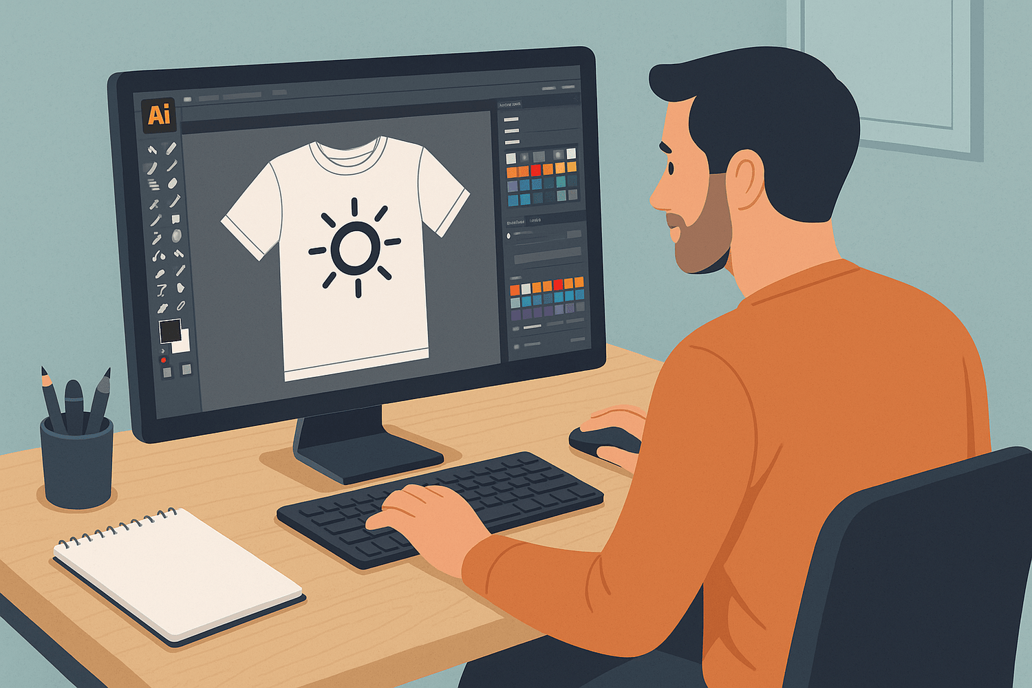
Screen printing requires precision, and vector files (like those created in Adobe Illustrator) are ideal because they are resolution-independent. This means your lines and shapes will stay crisp no matter the size. Raster images (like JPEGs, PNGs, or PSD files) are pixel-based and can lose clarity when scaled.
Best Practice:
Use vector formats for logos, text, and graphics whenever possible. If raster images must be used (e.g., in a photorealistic design), ensure they are at least 300 DPI at print size and avoid compressing the file.
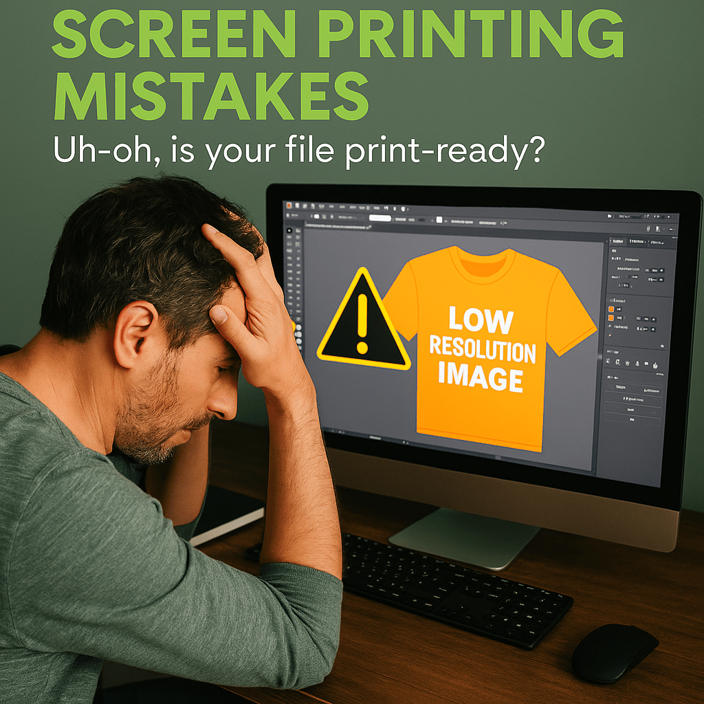
2. Why DPI Matters (Hint: 300 DPI is Standard)
DPI, or dots per inch, determines the resolution of your raster images. For screen printing, 300 DPI at the actual print size is the gold standard. Submitting a 72 DPI image (common in web graphics) will result in pixelation, blurry edges, and poor quality prints.
Tip:
Before exporting, always double-check your design file’s resolution. If your design was created at a smaller size, increasing the DPI after the fact won’t fix the loss of detail.
3. Convert Text to Outlines (and Why Fonts Can Be a Problem)
Fonts are not always embedded into files and may not appear correctly if the printer doesn’t have the same typeface installed. Converting all text to outlines (also called “curves” in some programs) ensures your typography remains exactly as you designed it.
How to Convert in Illustrator:
Select the text → Right-click → Create Outlines.
Reminder:
Once text is converted to outlines, it is no longer editable—so always save a copy of your file with live text for future edits.
4. Color Mode: RGB vs. CMYK vs. Spot Colors
RGB is best for screens; CMYK is for traditional printing presses. For screen printing, spot colors (such as Pantone Solid Coated swatches) are typically used. Spot colors give the printer precise control over ink matching and allow for accurate color separations.
Best Practice:
Use Pantone spot colors when possible. Avoid submitting RGB files unless your printer specifically requests them, as converting them can drastically shift colors.
5. Separating Layers for Multicolor Prints
Each color in a screen-printed design is applied with a separate screen. That means each color needs its own layer or channel for clean separation. Overlapping colors or blending without proper separation leads to misalignment and color muddiness.
Designer Tip:
Use layers to isolate each color, name them clearly (e.g., “Red – Pantone 186C”), and avoid using unnecessary effects or blending modes.
6. Avoiding Gradients and Halftones for Simplicity
Gradients and halftones can be printed, but they add complexity. Gradients need to be converted into halftones—dot patterns that simulate shading. If not handled correctly, they can look blotchy or lose detail.
Recommendation:
Unless you're working with a screen printer experienced in halftone/simulated process printing, stick with solid, flat colors for the cleanest and most consistent results.
7. File Types: What’s Best? (AI, PSD, PDF, EPS)
- AI (Adobe Illustrator): Best for vector artwork; preferred by most printers.
- PSD (Adobe Photoshop): Use for raster images, but make sure layers are named and organized.
- PDF: Great for proofs, but must be saved with correct settings (embed fonts, preserve layers, high resolution).
- EPS: Works for both raster and vector, but not as flexible for editing.
Pro Tip:
Before sending files, confirm with your screen printer what formats they prefer—some may have templates or specifications for file setup.
8. Bonus: Prepping a Mockup to Show Placement
A mockup helps your printer (and your client) visualize how the design will look on the final garment. It should include:
- The garment style and color
- The design size (in inches)
- The placement (e.g., chest, back, sleeve)
- Optional: centerlines or guides for alignment
Tool Suggestions:
Use Photoshop or Illustrator templates, or online mockup tools like Placeit or Smartmockups.
Leave a comment
This site is protected by hCaptcha and the hCaptcha Privacy Policy and Terms of Service apply.