

Even experienced designers can overlook key details when designing for screen printing. This list-style post highlights the most common mistakes that slow down production, create poor prints, or frustrate screen printers, and how to easily fix them.
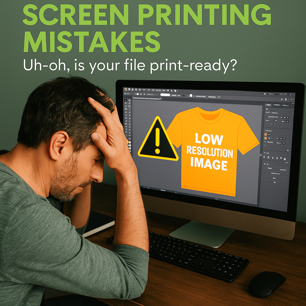
1. Using Low-Resolution Images
The Problem: Low-res images (typically under 300 DPI) result in blurry or pixelated prints, especially on large apparel formats.
Fix It: Always design at 300 DPI or higher at actual print size. Avoid stretching web graphics or downloading low-res files from the internet. If you must use raster images, start with high-quality originals.
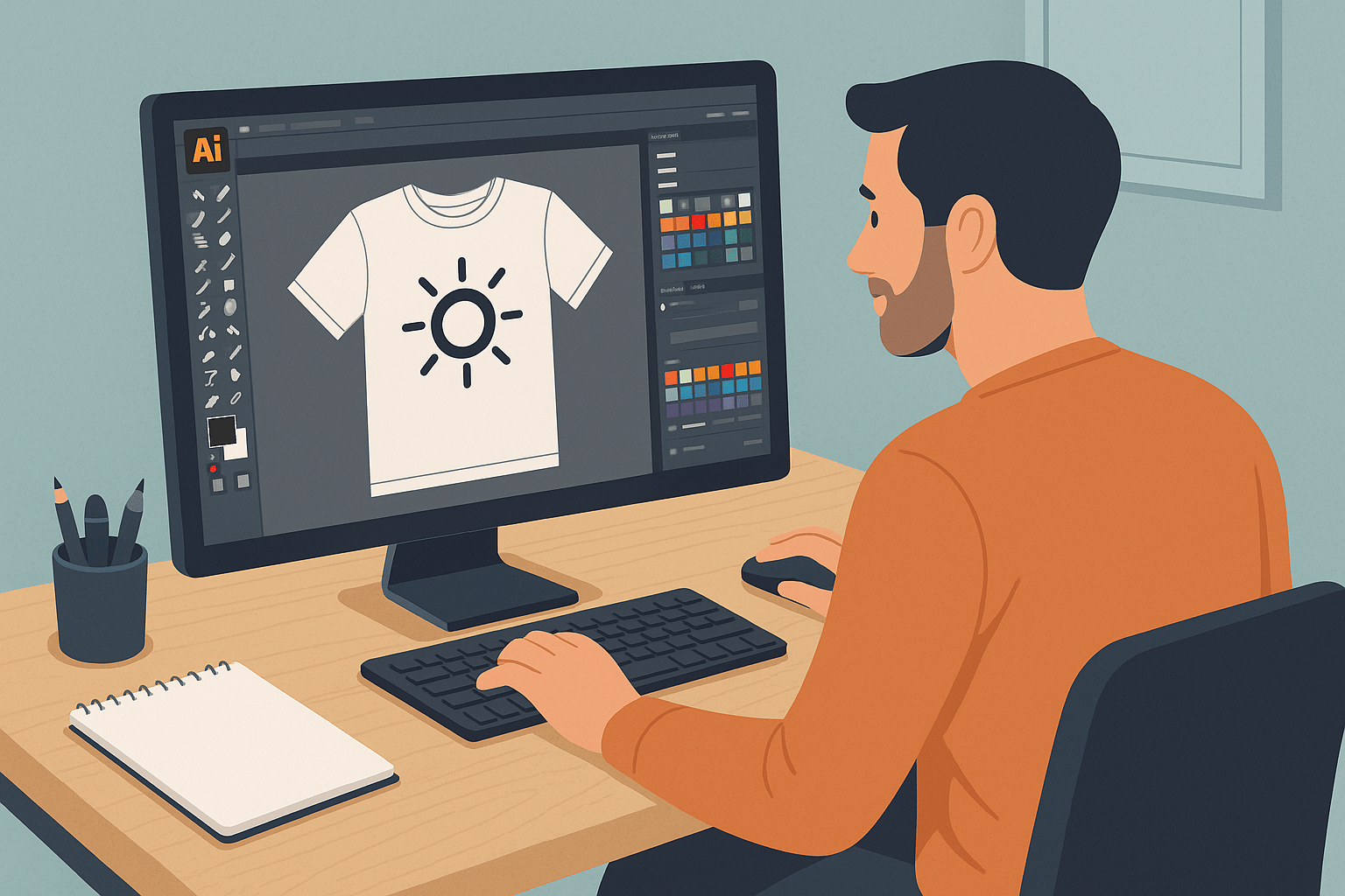
2. Forgetting to Outline Fonts
The Problem: Fonts may not display correctly if the printer doesn’t have your exact font installed, leading to substituted or missing text.
Fix It: Before sending the file, convert all text to outlines/curves in your design software (e.g., Adobe Illustrator). This ensures consistency and protects your typography.
3. Not Separating Colors Properly
The Problem: Every color in your design needs a separate screen. If your design has merged layers or blended colors, it becomes difficult to separate and print accurately.
Fix It: Use layered files, keeping each print color on its own labeled layer. Confirm with your printer how many colors/screens are feasible for your budget.
4. Ignoring Garment Color During Design
The Problem: Designing on a white artboard can mislead you when your design is going on a black or colored shirt. Light colors may disappear or clash.
Fix It: Mock up your design on the actual garment color. Use a background layer that matches the shirt color so you can design with contrast and readability in mind.
5. Using Gradients That Don’t Translate to Ink
The Problem: Gradients are difficult to print because screen printing doesn’t allow smooth transitions without special halftone techniques.
Fix It: Replace gradients with halftones or solid colors, or consult your screen printer to see if simulated process printing is an option. Simpler designs yield cleaner results.
6. Submitting the Wrong File Type
The Problem: JPEGs or flattened PNGs don’t allow for color separation, scaling, or edits. Raster files also tend to compress design quality.
Fix It: Submit your design in vector formats like AI, PDF, or EPS whenever possible. If using Photoshop, a layered PSD file at 300 DPI is acceptable—just make sure the layers are clearly named and organized.
7. Overdesigning with Too Many Colors
The Problem: More colors mean more screens, which increases cost and complexity. It also heightens the risk of misregistration during printing.
Fix It: Stick to 3–5 colors for most projects unless you’re working with a printer who specializes in high-color jobs. Consider using spot colors to reduce screens.
8. Poor Placement or Sizing for Apparel Types
The Problem: Designs that look good on paper may be too large, too small, or off-center on certain garments (e.g., tanks vs. hoodies).
Fix It: Use apparel mockups to test placement and sizing. Common print sizes for chest prints range from 9”–12” wide, but vary by garment type and size. Always double-check dimensions.
9. Failing to Account for Ink Bleed or Fabric Texture
The Problem: Fine lines, small text, or tightly spaced elements may bleed or blur on textured fabrics like cotton or tri-blends.
Fix It: Design with bold, clean lines and larger details, especially on rougher fabrics. Avoid ultra-thin fonts and closely spaced elements that might close up when printed.
10. Not Communicating With the Printer About Inks & Finishes
The Problem: Every screen printer uses different inks, mesh counts, and processes. Assuming they'll know your design intent without guidance can lead to surprises.
Fix It: Talk to your printer early. Ask about ink types (plastisol vs. water-based), fabric compatibility, screen limitations, and finish options. Share a clear mockup and color references (e.g., Pantone codes).
Wrap-up Tip:
Your screen printer is your partner, not just your vendor. The more clear and prepared your file is, the better your final product will look—and the more likely you’ll hit your deadlines without costly revisions.

Leave a comment
This site is protected by hCaptcha and the hCaptcha Privacy Policy and Terms of Service apply.