

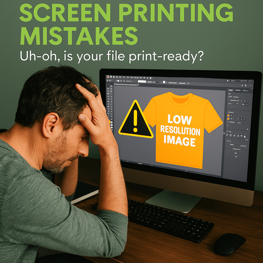
Want to elevate your apparel designs with depth, dimension, or texture? This post explores the artistic tools of screen printing—spot colors, halftones, and underbases—and how designers can prepare files to achieve amazing effects without sacrificing print clarity.
Spot Colors: Why They're Used and How to Set Them
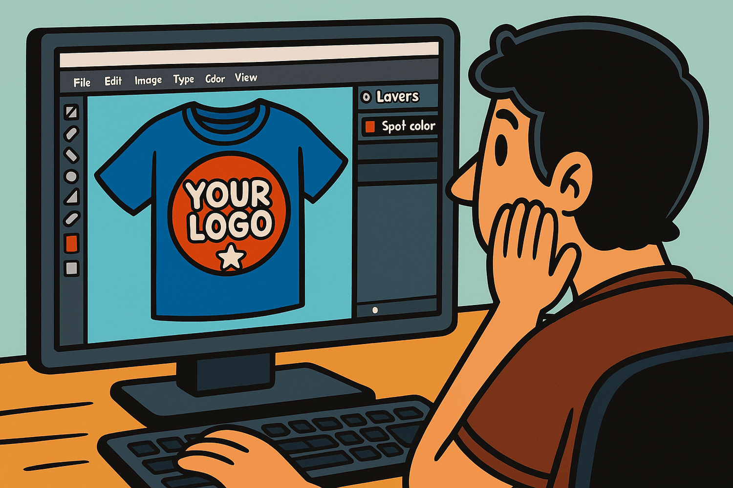
What They Are:
Spot colors are pre-mixed inks that print one solid color per screen. Unlike CMYK or RGB blends, spot colors give you precise, consistent color output, especially important for brand colors or bold graphic elements.
Why Use Them:
- Guaranteed color accuracy (e.g., Pantone Matching System)
- Cleaner separations for screen printing
- Lower risk of unexpected blending or muddy results
How to Set Them:
- In Adobe Illustrator, open the Swatches panel → Add Pantone spot colors via the Color Books option.
- Label your layers accordingly (e.g., "Pantone 186C - Red").
- Avoid applying transparency or effects to spot color layers.
Understanding Halftones: Creating Gradient Effects with Dots
What They Are:
Halftones simulate gradients by varying the size and spacing of dots. When viewed from a distance, these dots blend to mimic continuous tones—ideal for screen printing's solid ink nature.
Why Use Them:
- Allows smooth gradient-like effects using one ink color
- Reduces the number of screens needed
- Adds texture and depth to vector artwork
How to Create Them:
- In Photoshop: Convert grayscale artwork to Bitmap using halftone settings (angle, frequency, shape).
- In Illustrator: Use custom halftone patterns or plugins like Phantasm.
- Consult with your printer for optimal LPI (lines per inch) and screen mesh compatibility.
Underbases Explained: Essential for Printing on Dark Garments
What Is It:
An underbase is a layer of white ink printed first on dark garments so that colors printed over it appear vibrant and accurate. Think of it as a primer for your inks.
Why It Matters:
- Without it, ink colors on dark shirts can look dull or muted
- Especially important for light inks like yellow, pastels, and neons
Design Tips:
- Clearly designate underbase layers in your files
- Avoid complex overprinting—simplify where possible
- Work with your printer to ensure proper flash curing between underbase and color layers
Designing for Discharge Inks and Water-Based Inks
What Are They:
- Discharge ink removes the dye from dark shirts and replaces it with pigment, leaving a soft print.
- Water-based inks soak into fabric for a more breathable, vintage feel.
Why Designers Should Care:
- Both allow for softer prints compared to plastisol
- They behave differently—colors may appear more muted
- Best used with 100% cotton garments
Tips:
- Avoid fine details on blends (discharge doesn’t always activate properly)
- Test print if possible—colors can shift depending on garment
- Use bolder colors and simplified graphics for best results
Tips for Clean Trapping and Registration
What It Is:
Trapping involves creating slight overlaps between colors to prevent visible gaps due to misregistration during printing.
Why It’s Important:
- Even minor misalignments during print can show unsightly slivers of fabric between colors
- Helps maintain clean, professional edges
Design Best Practices:
- Add a 0.25 pt overlap between colors
- Use strokes or slight bleeds for bordering elements
- Avoid aligning small details from multiple colors tightly—plan for tolerance
Previewing Simulated Process Printing
What Is It:
Simulated process printing uses halftones and multiple spot colors to replicate full-color images (like photorealistic art) on dark shirts. Unlike CMYK, it's done with hand-separated layers in spot colors.
When to Use:
- High-detail images like portraits, artwork, or photographs
- Designs requiring a broad color range on dark garments
Designer Tips:
- Work with an experienced separator or print shop
- Use Photoshop channels for separations
- Avoid complex backgrounds; focus on central elements
- Be aware: this process often requires 8+ screens and higher setup costs
Common Pitfalls (Too Many Colors, Too Thin Lines, etc.)
What to Watch For:
- Too Many Colors: Drives up cost, increases screen setup time, and risk of misregistration
- Too Thin Lines: May not hold during printing, especially on coarse garments
- Too Much Detail: Overly intricate art doesn’t always translate well with screen meshes
Avoid By:
- Limiting your palette to 3–5 bold colors when possible
- Keeping line weights above 1 pt
- Testing high-detail designs with mockups or printer previews
- Communicating with your printer about what’s achievable with their equipment

Leave a comment
This site is protected by hCaptcha and the hCaptcha Privacy Policy and Terms of Service apply.